Current State
The existing tool captured basic scoring.
The iPad scorekeeper helped operators update points during live games, but it did not capture the deeper athlete-level data that could make BallerTV’s footage and game experience more valuable.
2019–2020
Aligning Product Direction Through Research
The Scorekeeper App focused on improving the workflow used to capture live sports data during games. Through extensive field research, usability testing, and in-context observation, I worked to understand how scorekeepers operated under real-world conditions where speed and accuracy were critical. The project included stakeholder alignment across teams, iterative testing of competing solutions, and the development of a functional prototype that allowed us to validate workflows before engineering investment. The result was a clear product direction supported by both users and stakeholders.

Context
BallerTV already used an iPad-based scorekeeper at events to control basic points during live games. The next opportunity was to capture more detailed athlete and game data — the kind of information AAU tournaments and other events often tracked through paper score sheets.
Current State
The iPad scorekeeper helped operators update points during live games, but it did not capture the deeper athlete-level data that could make BallerTV’s footage and game experience more valuable.
Business Need
More detailed scoring could support athlete stats, better game context, improved viewing experiences, and future product opportunities around player performance.
Design Challenge
Any new interface had to work in a fast, distracting event environment where scorekeepers needed to follow the game and enter data quickly.
Opportunity
Because detailed scorekeeping already existed on paper, the obvious direction was to recreate that workflow on an iPad. The deeper product opportunity was to separate the behavior from the artifact: what parts of paper scorekeeping needed to be preserved, and what parts could be improved through a digital interface?
The product needed to move beyond points and support richer athlete and game data without overwhelming the person operating the scorekeeper.
Scorekeeping happens while the game is moving. The interface needed to support fast recognition, quick entry, and easy correction.
Before committing to Apple Pencil, touch input, or a paper-like layout, the team needed to understand how scorekeepers actually behaved with an iPad in hand.
Workflow Research
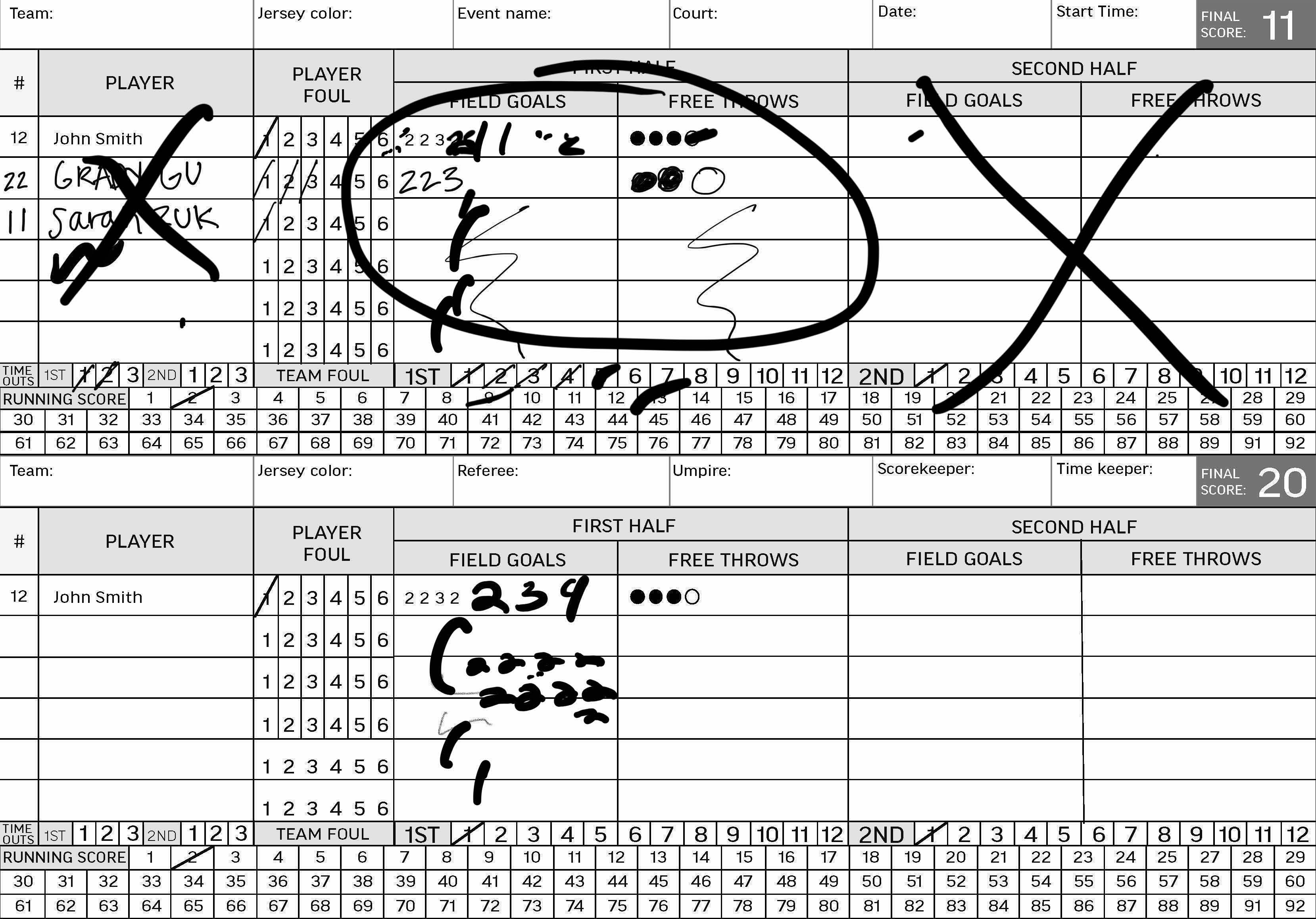
Basketball and volleyball score sheets showed how trained scorekeepers captured player actions, fouls, scoring, rotations, periods, and game flow. The research helped clarify the information architecture behind scorekeeping before moving into interface design.

Workflow Research
Basketball scorekeeping showed how player activity, fouls, scoring, periods, and game flow were captured in a dense but familiar paper format.

Workflow Research
Volleyball scoring introduced a different set of conventions, reinforcing that live data capture needed to account for sport-specific workflows.
Testing the Assumption
Even when the stylus was available, scorekeepers used their fingers instead. Touch input felt more immediate during live scoring.
Whether users wrote with a finger or Pencil, the output could still become messy and inconsistent. Athlete data needed to be readable after the game, not just recorded in the moment.
Trying to fit every scoring field into one paper-like screen made the interface dense and difficult to scan while following live play.
Field User Testing
After the Apple Pencil direction proved too messy and overwhelming, the next round tested different touch-first scoring models. The goal was to understand whether scorekeepers should add the overall score first, record athlete-level data first, or use more direct point-entry controls.

Design A
Tested whether scorekeepers would add the overall team points first, then assign athlete data afterward. The point adder stayed near the top of the score to keep the main game state visible.

Design B
Tested a model where each athlete and their scoring input came first, without a separate overall-score button. This explored whether team score could be built directly from player-level actions.

Design C
Replaced a generic add button with specific +2 and +3 controls for each athlete, testing whether more explicit scoring actions could reduce extra steps and decision-making.

Design D
Added a keyboard interaction after the first Apple Pencil test showed that users expected one to appear and that entering all data through a paper-like interface would feel overwhelming.
Result
The test showed that users did not think about team points and athlete data as separate sequential steps. They understood scoring as one connected action: who scored, and how many points did they add?
The keyboard pulled scorekeepers out of the live scoring flow and made the experience feel slower, heavier, and more manual.
Users did not think of adding points first and assigning athlete data later. The scoring action and the athlete action needed to happen together.
Design C was the favorite because the scoring actions were visible at the athlete level, reducing extra steps and making the flow easier to understand during live play.
Internal Testing
When the event schedule slowed down during back-to-school season, testing continued internally with a semi-working UXPin prototype. Participants were asked to scorekeep from a five-minute game clip so the team could compare how different input models performed during simulated live play.

Prototype A
Prototype A placed all scoring actions directly on the screen without additional modals or pop-ups. This made the actions visible, but the number of controls created smaller tap targets and a higher risk of input mistakes.

Prototype B
Prototype B placed a plus button next to each athlete category, then opened a modal to select the addition. This made the interface feel cleaner, but added extra taps to complete a scoring action.
Result
Prototype B felt cleaner and easier to understand because it reduced the number of visible controls on the screen. However, the extra modal step slowed down the scoring flow, while Prototype A’s surfaced actions were faster but harder to tap accurately.
Surfacing every action reduced extra steps, but the button sizes became too small to reliably tap during scorekeeping.
Most users preferred the modal-based version because it reduced visual density and made the screen easier to process.
The strongest path was not simply A or B. The design needed the clarity of Prototype B without making users work through too many extra taps.
Final Prototype
A scorekeeper built for the pace of the game.
The second round of internal testing focused on substitution because the previous test revealed uncertainty around how athletes should move in and out of active play. The final prototype also replaced the modal-based point entry with an overlay button layout, making athlete scoring actions more immediate.

Final Direction
After multiple rounds of testing, the team used the research findings to define a more practical first version of the scorekeeping app. The goal was to capture richer data than the existing scorekeeper without adding workflows that would slow scorekeepers down during live games.
Scorekeepers did not always have time to collect full athlete names from coaches before or during an event. Jersey numbers became a more realistic way to identify players in the first version.
Scorekeepers sometimes needed to quickly add points to the team score without assigning them to a specific athlete. The design needed to support that fallback to reduce scoring delays, even if it introduced some room for error.
Subbing patterns varied too much across teams and events. Instead of requiring scorekeepers to sub players in and out, the direction shifted toward a long athlete list that could be rearranged as needed.
Outcome
The final direction moved away from recreating paper scorekeeping and toward a practical live scoring tool. By testing assumptions early, the team clarified which data was essential, which interactions slowed users down, and which features should be simplified for version one.
Research
Testing showed that scorekeepers did not use the stylus and that handwriting created readability and density problems.
Product
The team deprioritized athlete names and substitution tracking so the app could support real event conditions without overloading scorekeepers.
Design
The final direction supported quick team scoring, jersey-number-based athlete tracking, and a rearrangeable athlete list.
Reflection
This project reinforced that strong product design is not just about solving every problem at once. Athlete names, substitution tracking, and full paper-scorekeeping parity all sounded valuable, but testing showed they could slow down the core workflow. The better first version focused on speed, jersey numbers, flexible athlete lists, and a scoring model that fit the pace of live games.